Most businesses don’t need more technology—they need better decisions. That’s why we created Data Stories: a series that shows how you can solve any problem in any industry when you turn to the data.
Each story explores a niche business challenge and demonstrates how a data-first mindset powers better decision-making, smarter problem-solving, and measurable results.
Because no matter the challenge or the industry, the answer is always in the data.
Recruiters and workforce planners know that today’s hiring environment requires more than job boards and basic outreach. To build effective hiring pipelines and close workforce gaps, HR teams need to understand the people behind the applications: where they live, what barriers they face, and what roles they’re equipped to fill.
In this Data Story, we explore how demographic data can help Oregon organizations improve recruitment efforts, match job offerings to local needs, and make smarter, more community-aligned decisions.
Challenge: Recruiting in a Competitive and Complex Labor Market
In today’s competitive talent landscape, recruitment success relies on more than job postings and basic outreach. To build effective hiring pipelines, strategic talent acquisition requires an understanding of the demographic makeup of the target regions. This information is key to helping recruiters, HR professionals, and economic developers not only find talent but grasp the economic and educational dynamics that shape labor availability.
Oregon is one standout example for demographic analysis due to its economic diversity, geographic variability, and growing population centers. From urban regions like Portland and Eugene to the rural expanses of Eastern and Southern Oregon, the state features a wide range of conditions that influence workforce participation.
For both recruiters and business leaders, understanding the nuances between Oregon’s diverse counties and regions is essential for successful talent acquisition and workforce engagement. At both a practical and strategic level, these regional contrasts matter:
- Urban counties typically offer dense labor pools, more advanced infrastructure, and higher education attainment.
- In contrast, recruiting in rural counties usually requires more innovative strategies, such as remote incentives, training partnerships, or mobile workforce programs.
Why This Challenge Matters: Misaligned Recruiting Wastes Time and Talent
In practice, these regional and economic complexities often show up in ways that are easy to overlook—unless you have the data to see them. Ultimately, failing to account for these differences means missing out on qualified candidates and falling short of both community and business needs.
For example, common recruitment challenges include:
- Sourcing talent in rural areas with limited infrastructure or lower population density
- Misaligned salary offerings in regions with vastly different income distributions
- Recruiting for roles that require credentials not widely held in certain counties
- Overlooking hidden labor opportunities in emerging or underserved regions
- Missing the broader economic context when evaluating workforce availability
Without clear, county-level insight, recruiters risk one-size-fits-all hiring strategies that don’t meet local needs. To recruit smarter—and build stronger teams and communities—you need better visibility into the statewide labor landscape.
Solution: How to Find the Answer in the Data
By leveraging demographic data and interactive Power BI visualizations, recruitment teams can gain sharper insight into where and how to focus hiring efforts across the state, enabling them to tailor strategies to local conditions and overcome common recruiting challenges.
Here’s how we can use data to help organizations, HR professionals, and workforce planners better understand Oregon’s labor potential:
- Visualize population density to identify where the largest labor pools are concentrated and where creative approaches may be needed.
- Analyze income and poverty rates to anticipate economic barriers and align compensation or support programs accordingly.
- Evaluate educational attainment to assess workforce readiness and inform role targeting or upskilling initiatives.
- Compare counties side by side to reveal hidden opportunities or mismatches between workforce supply and demand.
With a clear view of local conditions, recruiters can move beyond guesswork and into proactive, data-guided action that can connect the right people with the right opportunities.
Sample Visualization: See the Data-Driven Mindset in Action
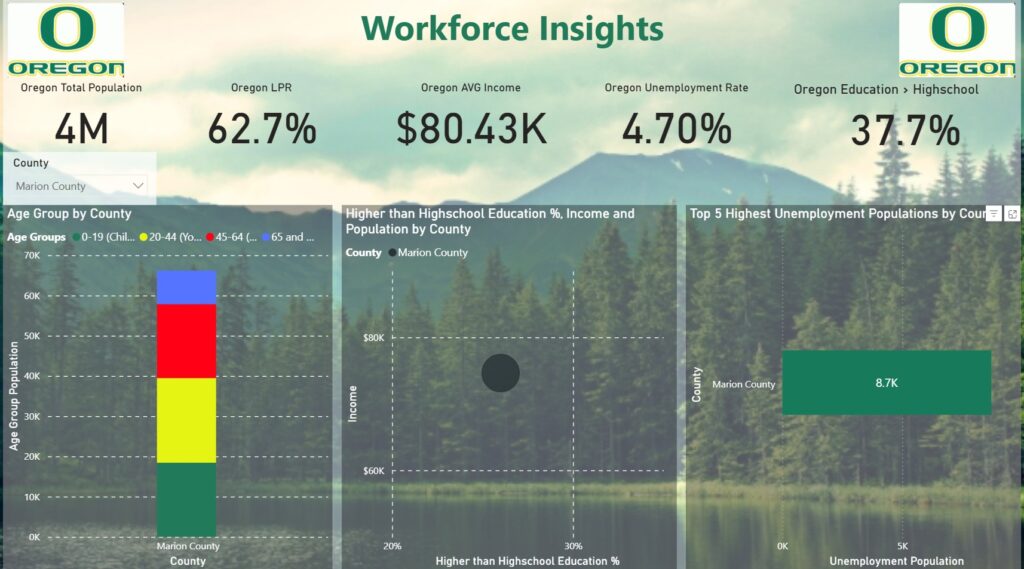
This one-page Power BI dashboard, Workforce Insights, was developed to present a data-driven analysis of Oregon’s workforce across multiple dimensions—demographics, education, income, and unemployment—delivered through a clear, interactive visual format. The goal of this dashboard is to empower recruiters, workforce planners, HR professionals, and economic development organizations with actionable intelligence. Using publicly available state and county-level data, this report consolidates key indicators into a single, intuitive view that can be filtered by geography and explored by dimension. Instead of relying on static spreadsheets or generalizations, users can now navigate the actual data behind workforce trends and tailor their recruitment or policy efforts accordingly.
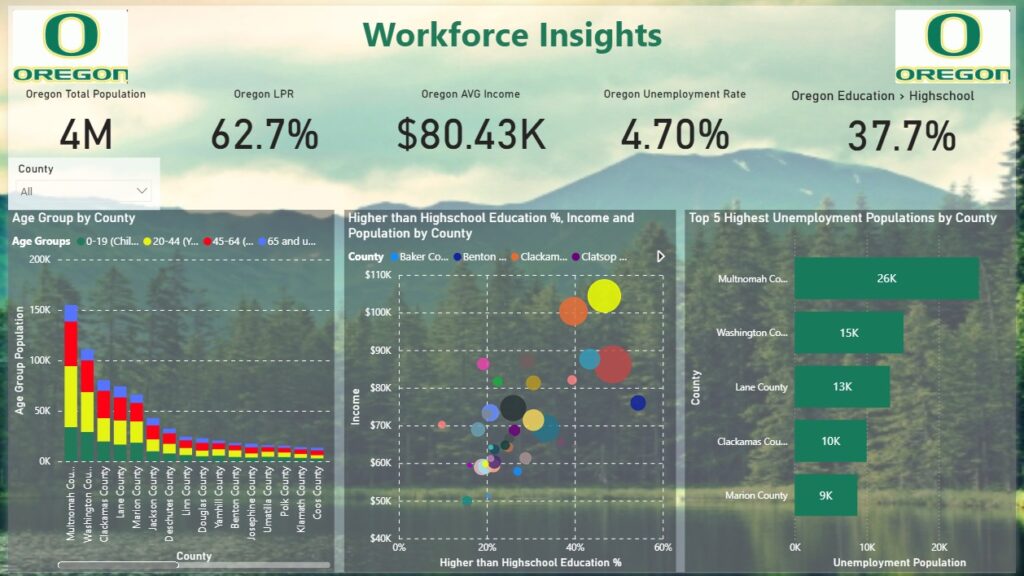
At the top of the report, several high-level key performance indicators (KPIs) frame the broader labor landscape in Oregon. The state’s total population stands at 4 million people, with a labor participation rate (LPR) of 62.7%, an average income of $80.43K, and an unemployment rate of 4.7%. Additionally, 37.7% of adults have attained an education level higher than high school. These KPIs immediately convey the strengths and limitations of the statewide workforce pool and provide a useful benchmark against which to compare individual counties.
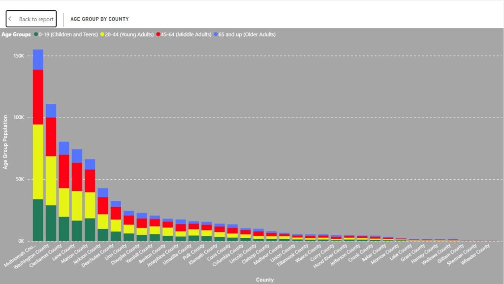
Age Distribution by County
The dashboard offers several core visualizations that break down this high-level view. One of the most important is the age group distribution by county. Displayed as a stacked column chart, it categorizes populations into four distinct groups: children and teens (0–19), prime working age adults (20–44), mature workers (45–64), and retirees (65+).
By breaking down population by age and county, users gain a clearer view of regional workforce composition. Counties such as Multnomah, Washington, and Clackamas, which form the Portland metropolitan area, show the largest populations across all age groups. These urban hubs naturally attract many job seekers and provide fertile ground for talent acquisition, but the visualization also reveals promising growth in counties such as Deschutes and Lane, indicating emerging labor markets that recruiters may want to watch.
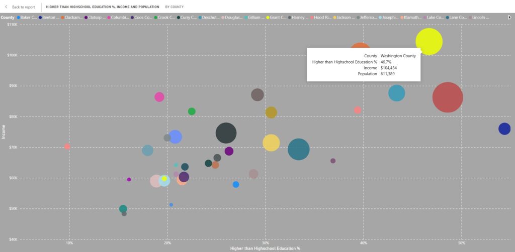
Educational Attainment by County
The center of the report features a particularly valuable visual in the form of a bubble chart that plots counties based on three metrics simultaneously: the percentage of residents with education beyond high school, average income, and total population size.
The x-axis represents the percent of the population with education above high school, the y-axis reflects average income, and the size of the bubble indicates total population. This tri-variate approach allows users to quickly identify counties that combine a large, well-educated population with strong income levels. For instance, Washington County, home to many of Oregon’s major employers and technology firms, appears as a large bubble with both high income and high educational attainment. Multnomah County also performs well across all three metrics.
These insights are critical for employers looking to fill skilled positions or expand operations, as they help pinpoint where the most qualified labor pools are located.
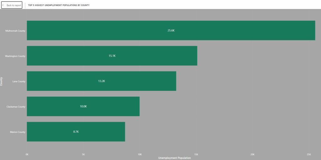
Top 5 Highest Unemployment Populations by County
On the right side of the report, another key visual identifies the five counties with the largest number of unemployed individuals—not by percentage, but by absolute count. Multnomah County leads with an estimated 26,000 unemployed residents, followed by Washington County with 15,000, Lane County with 13,000, Clackamas County with 10,000, and Marion County with 9,000. This visual is especially useful for workforce development programs and public-private employment initiatives, as it highlights where job opportunities may have the greatest immediate impact. These figures also help organizations prioritize outreach and support efforts, such as job fairs, reskilling initiatives, and employer partnerships in high-need areas.
For employers looking to recruit in these areas, it’s important to consider providing supportive services or collaborating with local workforce agencies to address structural employment barriers. With this proactive approach, you can not only enhance recruitment success but also help uplift communities and support long-term economic development.
Isolate particular counties
A slicer in the upper left corner of the dashboard allows users to filter all visuals by county. This interactivity transforms the report from a static display into a dynamic exploration tool. A user interested in just Marion County, for example, can isolate the data for that county across all visualizations—age group distribution, educational attainment, income, and unemployment—making it possible to develop localized workforce strategies in seconds.
Business Impact: Turn Demographics into Recruitment Strategy
With visibility into workforce-ready populations, economic conditions, and education levels, recruiters and decision-makers can make more informed hiring decisions.
Here’s how these insights can drive meaningful improvements in workforce planning and hiring outcomes:
- Recruiting agencies and HR teams: Target campaigns based on where qualified candidates are most likely to be found
- Workforce development boards: Align training and support services with regional employment barriers
- Corporate expansion planners: Evaluate market entry based on local labor dynamics
- Training providers and educators: Identify gaps in education to inform curriculum or workforce programming
With the right visual tools, teams can explore insights in granular detail to craft data-backed strategies, reduce hiring friction, and build workforce capacity where it’s needed most. The result is a more informed, more effective, and more community-aligned approach to recruitment.
Key Takeaways: Why the Answer Is in the Data
These examples highlight just a few ways demographic data can reveal new opportunities to improve recruitment strategy and labor market alignment.
The answers are in the data—but only if you know how to find them:
- The patterns your data shows may not match your assumptions. That’s why county-by-county insight is so powerful; it exposes local truths that statewide averages miss.
- Comparing regions side by side helps separate isolated challenges from broader trends. This supports smarter planning, especially when resources are limited.
- Interactive dashboards make complex datasets usable. You don’t need to be a data scientist to explore, test, and act on what the numbers reveal.
Every region has its own labor story. A one-size-fits-all hiring strategy won’t cut it, but a data-informed approach enables targeted outreach, guides smarter planning, and supports more equitable recruitment that builds stronger teams and communities.
Sources:
Explore Other Data Stories and Submit Your Industry:
Explore more LeapFrogBI Data Stories to see how other industries are solving problems with data:
How to Use Data to Rethink Car Accident Risk and Inform Smarter Safety Strategies
How to Use Data to Improve OR Efficiency and Strengthen Hospital Financial Performance
Got a business challenge you’d like us to explore? Contact us to share your industry challenge—and we might feature it next.
Because no matter the industry, the answer is in the data.