The Power BI Mobile app is an overlooked piece of the Power BI ecosystem. A shame, because it delivers quite a bit of value for business users on the go…no additional cost.Whether you are connecting to the Power BI Service, Premium Capacity, or an On-Premises Report Portal, the mobile app has you covered. You can download the app for iOS, Android, or Windows via their respective stores.
Sure, you can log into the Power BI Service via any browser. That’s great when your browser happens to be on a laptop or notebook. But when it is on a phone, it is a different story. You can only see a small portion of the page at any given time. Landscape orientation is a little better,but you still must scroll and zoom in/out to effectively interact with the report.
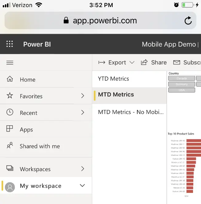
Here is what it looks like on my iPhone. Yikes! Portrait is awful, and landscape is only marginally better.
Fortunately, the mobile app provides a much better mobile experience. Even better? Power BI Desktop has some related features that will give you near complete control over how you see your data on your phone.
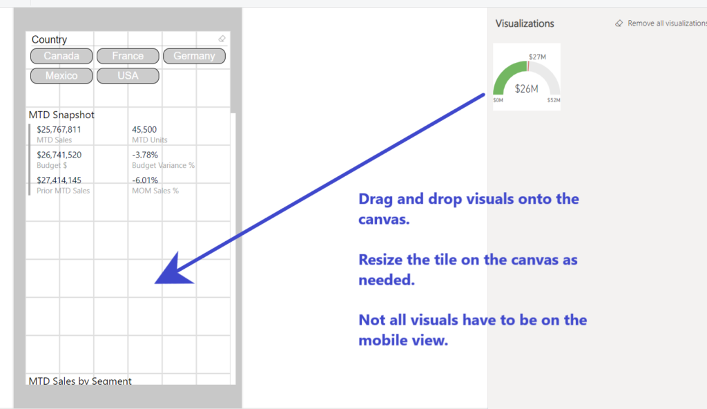
The trick to making the mobile app work is to set up reports with a phone view. This is done in Power BI Desktop and allows you to arrange and resize the visuals vertically, for easy scrolling. It is as easy as dragging and dropping the visuals from the right-side panel to the mobile canvas and arranging to user preferences.
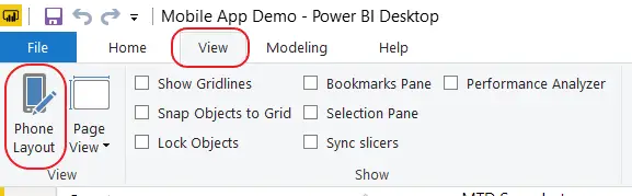
First, enable the phone layout by selecting the view tab, then clicking on the Phone Layout icon.
Then, drag the tiles (including slicers) you want onto the canvas.Easy as that. The great thing about the mobile layout is that you do not have to place all visuals on the canvas. In a way, it functions like a dashboard, in that you can pick and choose the metrics that you need to focus on while away from the office.
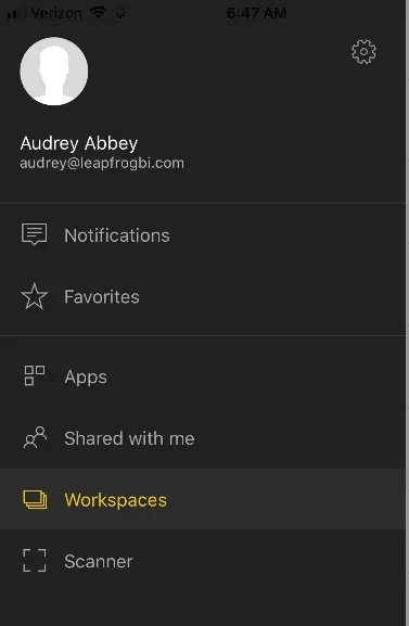
Once you have a report formatted for mobile, you can log into the app and navigate to an app, workspace, or favorites list. There is also a scanner that will scan QR and bar codes, which can then be used as filters. (More on that in a moment).
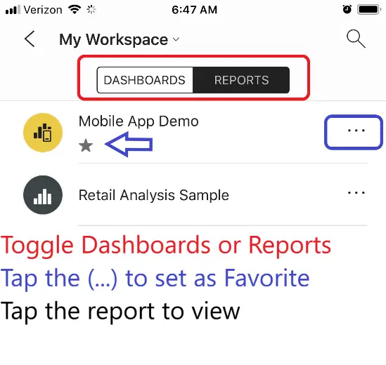
Navigate to a Workspace, toggle the screen to show Dashboards or Reports, then select a report or dashboard.
Navigate to a Report and explore the page menu options.
Swipe down to refresh your data.
Scroll up/down to find the visual you need.
Charts are interactive in the mobile app, so tap on any part of a chart to filter, or explore page filter options.
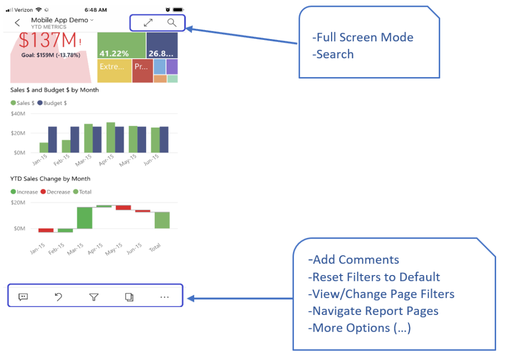
If you click on the Ellipsis for More options, you will find some special features that are unique to the Mobile App. Power BI Service doesn’t have this!
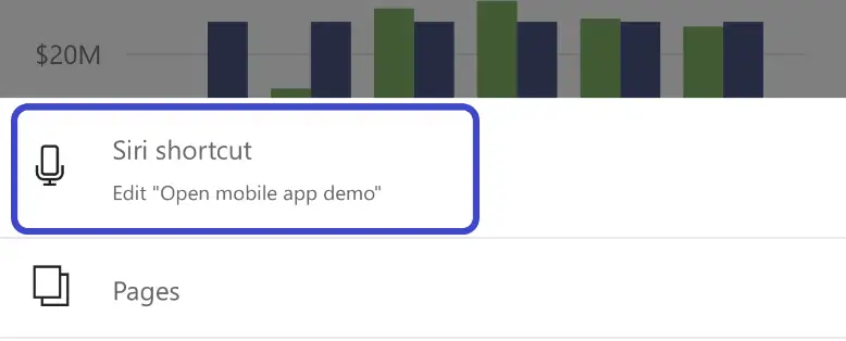
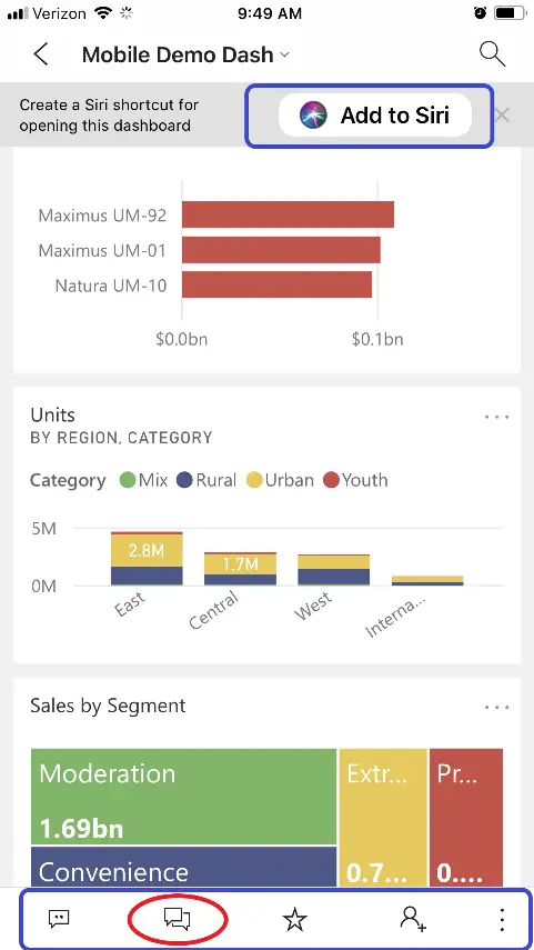
On iPhones, you can create Siri links to open reports hands-free. All the busy execs on the road? This is for you. Once the link it set up, you can just call out “Hey Siri – Open Mobile App Demo” and Siri will do exactly that! No hands required.
A few other incredible features to make note of:
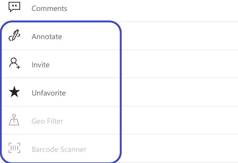
Annotate – See a metric that needs to be called out? Add a smile, frown, question mark, draw freehand, or add a text call out and send to a colleague via email or text. The person you are sending to does not need a Pro license. The app will send a non-interactive screenshot, with the annotation, either to text message or attached to an email.
Geo Filter – If your data has geographical data types like Addresses or City/State, you can use your current location to filter the report. That means you can walk into a customer location and have the reports filter for that customer – based on where you are.
Scanner – If your data has bar codes or UPC data, you can use the scanner to scan a bar code and it will filter the report page to that product/UPC code. That means you can walk the store or warehouse aisles, with product report in hand, and filter the report to whatever product you see on the shelves.
These three features are unique to the mobile app. You cannot do this in the Power BI Service. And it gets better. (No, really).
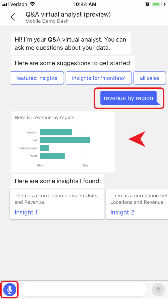
If you are looking at a Q&A enabled Dashboard, the mobile app also supports the same Q&A features that the service does. PLUS you can do this almost completely hands-free with voice recognition. That’s right: Power BI can understand simple questions about your data and will go fetch an answer.
Pro Tip:
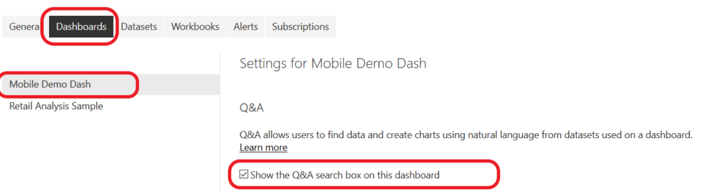
You can enable a dashboard to allow Q&A by navigating to Dataset > Actions > Ellipsis > Settings in the Power BI Service and then checking the box:
If you know exactly what you want and don’t want to hunt for it – just ask for it! On the flip side, if you don’t know what you want, you can explore your data via text/voice.
The dashboard screen has controls to add a Siri link up top, and the familiar ribbon of icons on the bottom.
Q&A enabled dashboards have a special icon on the ribbon:
Tap the Q&A icon to open the Virtual Analyst chat window. The VA will offer some featured insights and suggestions. You can explore this way, or type in your question (What are the year to date sales?) or key phrase (YTD Sales). The VA will fetch that number and display it on a card visual, since it is a single number with no categories or groupings.
Because Power BI works on dimensional modeling, you can also use a simple language pattern to get data in categories: “A measure by a dimension”. Measures represent business events that we want to sum, or count, or do math on. Dimensions are the who, what, when, where, and sometimes why of those business events. For a more in depth look at Facts, Dimensions, and Measures – link to existing article
Example: Revenue (a measure) by region (a dimension describing where the sale took place)
You can either type a question/phrase in, or you can activate the microphone and speak it. Either way, the VA will draw a chart to represent the data you requested.
Pro Tip:
You can define Featured Questions in Power BI Service, to pre-package common questions and specify the chart type. Featured Questions will show up in the Virtual Assistant’s window for easy access.
Got questions? Send an email to audrey@leapfrogbi.com with your questions, suggestions, or other feedback.