Report Description
- Industry: Healthcare
- Audience: RCM Managers
Use Case
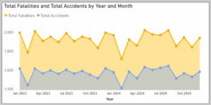
This 4-page report was built with Power BI but any BI front-end tool can be used to produce something equivalent. It displays both trend and point-in-time information about claim denials. These types of visualizations help managers look at general trends while at the same time capturing outliers.
How To Use This Report
In the first and second pages of the report, you observe that denials are trending downwards, but in a multi-location medical group, it’s important to understand if all units are trending consistently.
On both pages 1 and 2, there’s a Location selector. Select either Dallas or San Antonio and note that those two locations are not trending down.
On page 3, all 4 locations are displayed separately. Note that Registration and Authorization are main denial reasons in 3 of the 3 locations.
Page 4 allows you to see it at an even lower level. All dimensions are displayed on tables each ranked by Denial Amount in descending order. It’s now possible to see the CPT code with the most dollars denied. Click on it, and all other tables will now display data only for that CPT. That can be done for other dimensions too. Click on Denial Category ‘Registration’ and all other tables will now show values for that Denial Category.