Report Description
- Industry: Insurance
- Audience: Actuaries, Finance, Claims Managers
Use Case
This Power BI report shows how claims and incurred loss data can be compiled into a central repository and displayed in a variety of visualization styles supporting decision-making by a variety of insurance business functions.
How can historical information be used to support book profitability forecasting? – Observe how losses behave differently for each loss year.
What patterns are observable in the curve positions ? – Note that loss curves are shifting higher every year indicating a negative trend.
How do years differ from each other? – In addition to shifting higher, are they also trending up faster?
How To Use This Report
Move to Page 2
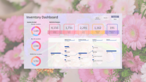
Click on to the second page of the report to see claim volume information.
Hover
You can hover over many chart elements, like a line or a columns, to reveal additional details.
Filter by clicking chart elements
All of the charts on a page can also act as filters for each other. For example, click a dimension, like a location, a payor or an aging bucket, and all related charts will update automatically. To clear the filter, click the same dimension again.