Most businesses don’t need more technology—they need better decisions. That’s why we created Data Stories: a series that shows how you can solve any problem in any industry when you turn to the data.
Each story explores a niche business challenge and demonstrates how a data-first mindset powers better decision-making, smarter problem-solving, and measurable results.
Because no matter the challenge or the industry, the answer is always in the data.
Retail businesses with multiple locations face an ongoing challenge: how to identify which stores are thriving, which are lagging, and why. It’s tempting to look at revenue alone, but when all your stores are bringing in similar numbers, revenue can blur the real performance picture.
In this Data Story, we explore how a fictitious coffee chain called The Busy Bee refined raw metrics into meaningful KPIs and how synthesizing those KPIs revealed operational inefficiencies and hidden top performers.
Challenge: Same Hive, Different Buzz
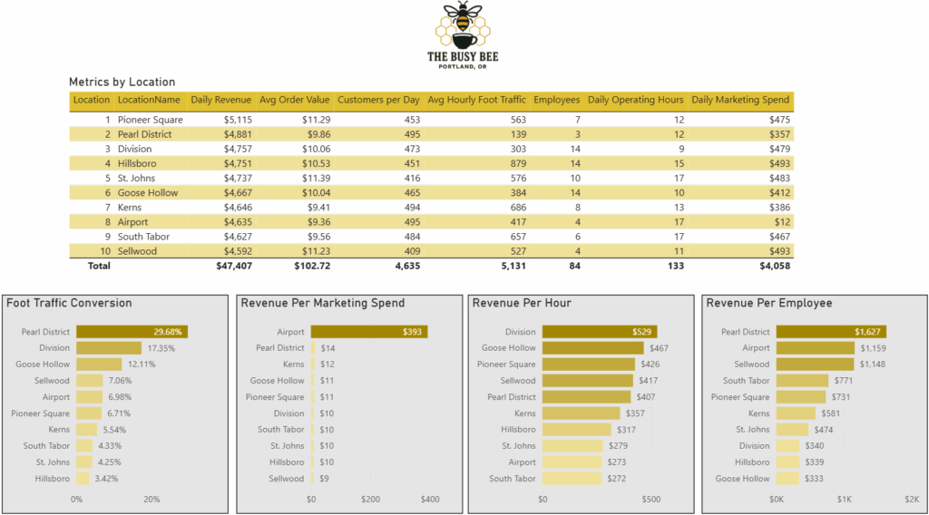
At first glance, all 10 Busy Bee locations in Portland, OR appear similarly successful. Each generates $4,500–$5,100 in daily revenue and boasts average order values between $9.36 and $11.39. But the owner suspected some shops might be “doing more with less,” while others might be overstaffed or inefficient despite strong revenue.
This challenge shows up in real life when: – Leadership ranks performance by revenue alone – Locations operate with very different staffing, marketing spend, and hours – Small differences get lost because revenue is relatively consistent – Managers can’t identify which levers (staff, hours, marketing) drive results.
Common challenges:
- Relying on revenue alone hides performance differences
- Staffing, hours, and marketing vary widely between locations
- Raw metrics are on different scales (dollars vs. counts vs. hours)
- High-performing teams aren’t obvious from the surface
Why it matters: Oversimplifying performance masks easy opportunities for improvement. Without a holistic view, leadership risks wasting resources on overstaffed shops while missing opportunities to scale efficient ones.
Solution: Finding the Sweet Spot
The Busy Bee team moved beyond raw revenue by engineering four derived KPIs from their existing dataset (employees, foot traffic, marketing spend, operating hours):
- Foot Traffic Conversion Rate (FTCR) – % of passersby who become customers
- Revenue per Employee (RPE) – Efficiency of labor resources
- Revenue per Marketing Spend (RPMS) – Marketing return on investment
- Revenue per Operating Hour (RPOH) – Revenue throughput per open hour
Step 1 – Engineer key KPIs from basic metrics
Convert raw counts (foot traffic) into meaningful ratios (FTCR). Normalize costs and hours into per-unit productivity measures. Align all KPIs to a comparable scale (dollars or percentages).
Step 2 – Compare performance across locations by KPI
Pearl District excelled with the highest FTCR (29.68%) and highest RPE ($1,627) despite low foot traffic and fewer staff. Division led in RPOH ($529) while operating just 9 hours/day, showing long hours aren’t always profitable. Airport dominated RPMS ($393), though as a captive-audience location it’s an outlier.
Step 3 – Synthesize KPIs into a performance index
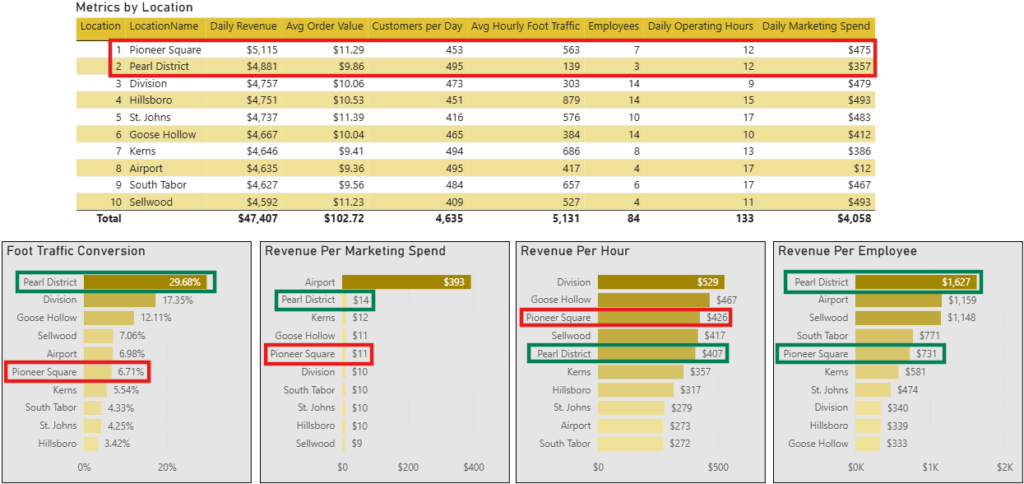
Ranked each shop 1–10 per KPI, then averaged ranks to reveal overall performance. This highlighted that Pioneer Square, once the presumed #1 based on revenue, didn’t lead in any efficiency metrics. Pearl District emerged as the true top performer: doing more with less.
Lorem ipsum dolor sit amet, consectetur adipiscing elit. Ut elit tellus, luctus nec ullamcorper mattis, pulvinar dapibus leo.
Sample Visualizations: Buzz-Worthy Impacts
KPI Comparison by Location
This visualization shows base metrics (employees, foot traffic, marketing spend, hours) vs daily revenue.
Insight: Revenue alone is misleading. Pearl District nearly matches Pioneer Square’s revenue with half the staff and lower foot traffic.
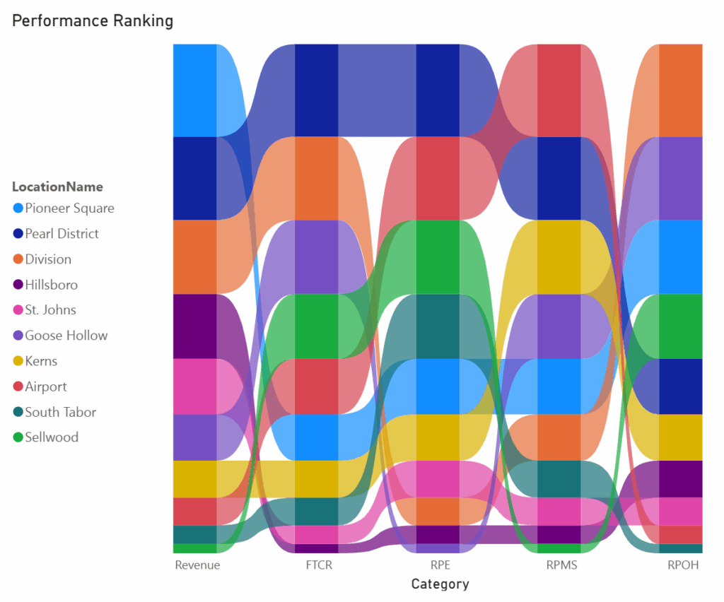
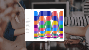
Derived KPI Rankings
A ribbon chart ranks each location across FTCR, RPE, RPMS, and RPOH.
Insight: Pearl District leads in 2 categories, Airport wins marketing ROI, and Division proves efficiency isn’t tied to long hours.
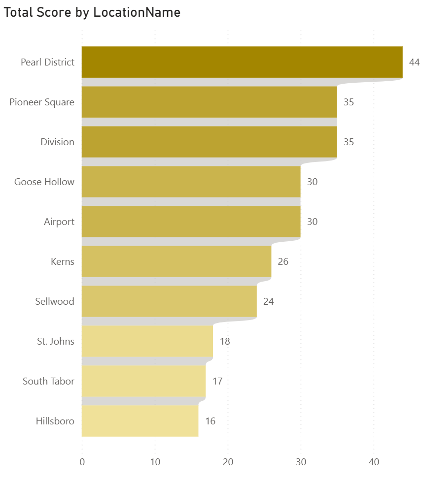
Consolidated Performance Index
A composite score shows true “leaders and laggards.”
Insight: Pearl District, Division, and Pioneer Square lead overall; Hillsboro and Goose Hollow lag. This index cuts through noise to focus attention.
Business Impact: Clearer Vision, Smarter Decisions
By reframing the data, Busy Bee’s leadership can:
- Replicate what works – Apply Pearl District’s lean staffing model to underperformers
- Right-size operations – Adjust hours where revenue per hour is low
- Reallocate resources – Shift marketing spend away from low-ROI stores
- Future opportunity – Use Power BI AI features to forecast KPI impact (e.g. “If we cut 2 staff at Goose Hollow, what happens to RPE and revenue?”)
Key Takeaways: Why the Answer Is in the Data
These examples highlight just a few of the ways data can reveal new opportunities to improve efficiency and store performance. Your data holds answers — but only if you know where to look. With these principles, we can turn your data into strategic wins:
The data challenged assumptions
Revenue suggested Pioneer Square was the leader in revenue, but efficiency metrics revealed Pearl District outperformed with fewer staff and lower foot traffic.
Side-by-side KPIs exposed patterns
Comparing FTCR, RPE, RPMS, and RPOH showed which stores were converting customers well and which were overstaffed or underperforming.
Visuals made complex data clear
Dashboards like the ribbon ranking and performance index made it easy to see who was thriving and where support was needed.
Every business is different. A one-size-fits-all approach won’t work, but a data-first strategy ensures you’re ready for whatever comes next.
Explore Other Data Stories and Submit Your Industry
Explore more LeapFrogBI Data Stories to see how other industries are solving problems with data:
Got a business challenge you’d like us to explore? Contact us to share your industry challenge—and we might feature it next.
Because no matter the industry, the answer is in the data.