Insurance agencies rely on data to optimize claims, assess risks, manage policies, and drive growth. But just generating raw numbers isn’t enough to move your business forward. To get real value from your agency’s data, you need an efficient way to organize, analyze, and interpret the metrics so you can make strategic decisions that truly make a difference.
Easier said than done. Despite having access to more data than ever, many insurers struggle to meaningfully use their data to guide daily decisions or inform long-term planning.
In fact, in an interview with Deloitte, chief data analytics officers and insurance analytics leaders called out siloed data as a main roadblock and the reason why their organizations are “stuck in the early stages of data management maturity” and unable to make their data truly “accessible, shareable, and actionable.”
This is where dashboards can help.
In this blog post, we cover why dashboards are essential for insurance tracking and list the top eight most valuable dashboards for insurance agencies.
8 Best Insurance Dashboards for Performance and Key Metrics
Dashboards consolidate key metrics from across your organization into a single source of truth—that means fewer spreadsheets, less time spent on manual reporting, and more actionable data that’s easier to use.
But what dashboards should an insurance agency use to monitor performance and key metrics?
While the needs of every insurance agency are different, there are a few go-to dashboards you can rely on for both high-level oversight and detailed analysis.
Here’s a look at the best eight insurance dashboards for insurance agencies to measure, monitor, and improve performance and key metrics:
1. Book of Business Dashboard
A Book of Business dashboard is a centralized reporting tool that gives your agency a comprehensive, real-time view of your entire client portfolio and active policies.
It consolidates data like:
- Policy status and performance metrics
- Client and account-level activity
- Agent production and regional performance
With all of this data reliably organized, up to date, and accessible in one easy-to-navigate place, a Book of Business dashboard empowers your agency to swiftly identify and track trends, spot growth opportunities, and monitor performance across segments so you can make more informed, strategic decisions that drive profitability and retention.
Trying to navigate all of this data without a centralized dashboard is a different story.
Consider: Your team is forced to scour spreadsheets across different systems and stitch together disparate data to try and create an overall view of your business performance. This process isn’t just time-consuming; it’s risky, opening the door for reporting gaps and analytical blind spots.
A Book of Business dashboard eliminates this headache and manual overhead so you can spend less time searching for and organizing data and more time actually using it to tackle problems that move your agency forward.
Want to see an example? Check out this fully interactive Book of Business dashboard.
2. Claims Management Dashboard
A claims management dashboard is a centralized reporting solution that gives you a clear, real-time look at your agency’s claims activity, from initial intakes to resolutions.
It brings together data like:
- Claim volumes by type, status, region, or amount
- Key performance indicators, e.g., claims ratio, time to settlement, payout per claim
- Denial rates and claim history across accounts or policy types
Claims management is one of the most complex areas of the insurance business, especially when you’re dealing with multiple parties or facing legal implications. Without full visibility into how claims are handled, it’s even harder to track performance, identify delays, and, ultimately, take action to improve outcomes.
Plus, relying on spreadsheets and siloed systems for claims management data introduces unnecessary friction, slowing down your teams with time-consuming manual work and increasing the likelihood of errors.
A claims management dashboard simplifies the entire process.
It consolidates and visualizes claims data, KPIs, and historical trends, giving your agency much-needed clarity to monitor performance and pinpoint bottlenecks, all while reducing administrative overhead.
You can even use a claims management dashboard to help snuff out potential fraud. Its granular insights can surface suspicious, high-value, or repeat claims that might otherwise get buried in more high-level reports, making it easier to identify would-be fraudsters, a persistent problem that experts estimate costs $308 billion every year.
3. Policy Management Dashboard
A policy management dashboard provides real-time insights into key policy lifecycle metrics—from issuance to endorsements, renewals, and cancellations.
It centralizes data like:
- Active and expired policy counts
- Renewal timelines and lapse trends
- Coverage types and policy changes over time
Policy management is, of course, a fundamental part of daily insurance agency operations, and it is complex. Without clear oversight, it’s easy to miss critical points in the life cycle.
Many insurance agencies, however, still rely on static reports or scattered systems that slow everything down, forcing teams to react to problems instead of getting ahead. Down the line, missed renewals, delayed outreach, or other policy management missteps can directly impact both customer retention and revenue.
A policy management dashboard changes all that.
It brings together real-time data into a single view, giving your team the on-demand insights they need to flag at-risk accounts, automate follow-ups, and deliver timely, personalized outreach. Ultimately, this full visibility into policy lifecycles makes it easier for your teams to focus on retention, reduce lapses, and strengthen customer relationships.
Want a closer look? Dive into more insurance dashboard and report samples.
4. Financial Performance Dashboard
A financial performance dashboard centralizes your most impactful data to give you real-time insights into your agency’s bottom line.
It unifies data like:
- Written vs. earned premiums
- Loss and expense ratios
- Profitability by product, channel, or region
Understanding your agency’s financial performance goes well beyond simple revenue tracking in spreadsheets and static reports. Actually, in many cases, those manual tools just make it harder to see what’s really driving outcomes. Without a clear, consolidated view of your financial position, it’s a challenge to connect the dots between performance, pricing, and growth.
A financial performance dashboard gives you clarity.
With one easy, unified view, a financial dashboard surfaces the data you need to monitor financial KPIs in real time, drill into results by business segment, and quickly identify where strategy adjustments are needed.
This insight makes it much easier to pinpoint what’s driving growth for your agency and what’s bringing it down. From there, you can plan strategically with confidence and precision to optimize operations, allocate resources more effectively, and prepare for greater financial stability.
5. Underwriting Assessment Dashboard
An underwriting assessment dashboard gives you real-time visibility to manage underwriting operations more efficiently, without the administrative drag.
It pulls together data like:
- Submission-to-bind ratios
- Quote turnaround times and cycle times
- Decline rates and quote conversion trends
According to Capgemini’s 2024 World Property and Casualty Insurance Report, underwriters spend over 40% of their time on administrative work—often because data is incomplete, scattered, or hard to access. This not only takes underwriting teams away from the more strategic, high-impact work that drives profitability, but it also slows down decision-making and increases the risk of errors.
An underwriting assessment dashboard helps reclaim that lost time.
By centralizing all underwriting data in one place, an underwriting assessment dashboard makes it easier for teams to visualize and track performance. This means they can spend less time chasing down data and more time actually using it to work on higher-value tasks, like evaluating risk, pricing policies accurately, and writing more profitable business.
Learn more ways insurance underwriting efficiency analytics can help you optimize outcomes.
6. Regulatory Dashboard
A regulatory dashboard gives your agency a centralized way to stay on top of evolving compliance requirements by automatically tracking and consolidating key metrics, like:
- Audit readiness and reporting status
- Compliance rates by product, ream, or region
- Regulatory changes and flagged risk indicators
Regulatory requirements are always changing, and missing updates can have serious consequences for your agency. In fact, according to their 2025 Insurance Regulatory Outlook, Deloitte predicts that remaining compliant will become even more challenging for insurance agencies as both state and federal levels introduce new complexities.
A regulatory dashboard helps you mitigate risks.
Instead of scrambling to gather reports ahead of audits or regulatory updates, your team can turn to your regulatory dashboard for instant access to up-to-date, accurate data, like audit status, compliance flags, and other critical indicators.
With all relevant regulatory data automatically consolidated in one place, your agency can not only reduce manual reporting tasks but avoid costly compliance errors and stay audit-ready, all the time.
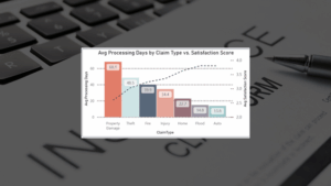
7. Loss Ratio and Loss Triangle Dashboard
A loss ratio and loss triangle dashboard gives your agency a focused, data-driven view of how claims develop over time—a must-have for accurate pricing, strategic reserve planning, and long-term profitability.
Specifically, it brings together actuarial and claims data like:
- Loss ratios across products, agents, and regions
- Claims development by maturity and loss year
- Incurred vs. paid losses over time
Actuaries depend on clear, timely trendlines to evaluate how losses compare to premiums and how those patterns shift over time. Without structured visibility into claim development, pricing and reserve strategies are often built on guesswork.
A loss ratio and loss triangle dashboard gives you the precise forecasting power to plan with confidence.
It breaks down historical loss trends by agent, region, product line, or timeframe, delivering the insights needed to optimize reserves and support forward-looking decisions.
Plus, because it visualizes claims performance over time (e.g., capturing emerging losses, settlement trends, and reserve requirements), a loss ratio and loss triangle dashboard also helps your team track how losses evolve, flag anomalies, and refine pricing models—using hard data to make decisions instead of best-guess estimates
The impact is real. According to a new McKinsey report, insurers using advanced data and analytics can improve loss ratios by three to five points.
See it in action: Explore this fully-interactive example of a loss triangle report
8. Producer Performance Dashboard
A producer performance dashboard gives your agency real-time visibility into individual agent activity, so you can track performance, reward results, and coach more effectively.
It consolidates key metrics like:
- Quote-to-bind ratios
- New policies written
- Referral volume and close rates
When you track agent performance manually, it’s easy to let things slip through the cracks. Without a clear view of agent activity, training, and incentive programs, you may overlook both red flags and top performers.
A producer performance dashboard makes sure you never miss key performance signals.
But it’s not just about the numbers. When built right, this dashboard can be a powerful tool to help you celebrate employee wins, spot growth opportunities, and step in with timely, targeted coaching when needed.
Over time, these actions help boost employee engagement, improve retention, and build stronger, happier, more productive teams. That’s right, new research from Gallup shows that employees who feel recognized and supported are almost 50% less likely to quit—proof that better data drives better outcomes for your team and your bottom line.
Need a Specific Insurance Dashboard? We Can Build It for You.
You’ve likely heard that your insurance business should be “data-driven” but making your data work for you is easier said than done. Without the right tools or expertise, insurance reporting often remains manual, incomplete, or too disconnected to be helpful.
That’s where most companies get stuck, and where we help them move forward.
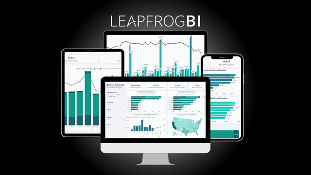
At LeapFrogBI, we build customized insurance dashboards that turn fragmented data into reliable insight, tailored to your agency, your data, and your goals.
From carriers to MGAs, MGUs, wholesalers, and brokers, we understand insurance reporting and data analytics in and out. Most importantly, we know how to create high-impact dashboards that empower you to transform raw data into the targeted, actionable information you need to power strategic, data-driven decision-making.
Plus, our team manages everything from data infrastructure to dashboard delivery, so you don’t need to hire and develop a full-time internal business intelligence team to start realizing the full value of your data.
Ready to stop wrangling data and start using it to drive your business forward? Schedule your FREE 30-minute consultation to see which insurance dashboards we can build to help you finally put your data to work.