Business owners have never had more access to data. Every day, you can collect information from your CRM, ERP, and other applications about customer engagement, sales pipelines, and operational performance. But making sense of that data and figuring out how to use it to drive faster, more informed decision-making is easier said than done.
Consider this: In Sigma Computing’s State of BI 2025 Report, 87% of businesses reported an increase in data volume in the last year—but 71% said their business intelligence (BI) tools “aren’t keeping up.” It’s clear that the challenge isn’t simply collecting data; it’s figuring out how to make it useful.
Enter the humble but powerful data dashboard.
A data dashboard (AKA data analytics dashboard or data management dashboard) is a tool that consolidates key performance metrics into an easy-to-read visual display that enables users to scan, interpret, and use data to make faster, smarter decisions. This at-a-glance view into performance and progress simplifies complexity, aligns teams on priorities, and makes it easier for every department—from executives to analysts—to track KPIs and act on insights.
Designed smartly, data dashboards help you:
- Save time by eliminating manual reporting
- Accelerate decision-making with real-time visibility
- Align departments with a single source of truth
- Spot trends and risks early with visual cues
And the benefits extend across industries—from healthcare and insurance to logistics, manufacturing, and retail.
For example, research published in Scientific Reports shows big data analytics can improve hospital performance by enhancing decision-making quality and reducing unnecessary risk-taking. Similarly, Health Data Management highlights how data dashboards help insurers automate tasks, improve fraud detection, and minimize waste.
What is a data dashboard, exactly? In this blog post, get a closer look at the key features of an effective data dashboard, the different types of data dashboards, and what to do (and not do) to build a data dashboard.
What Are the Key Features of an Effective Data Dashboard
Not all dashboards can deliver the insights decision-makers need, especially if you’re relying on off-the-shelf templates that don’t reflect your business’s specific goals.
Here’s what a dashboard needs to deliver real value:
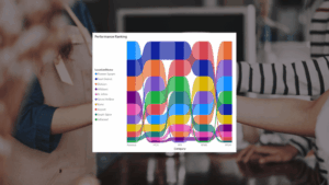
Visual Consistency
A consistent visual design is key to dashboard usability. If your layout, font, and colors are cluttered or inconsistent, it becomes harder for users to scan and interpret information quickly. Stick with a clean, cohesive design that minimizes visual noise and makes patterns easier to spot.
For example, when Platinum Dermatology Partners needed help standardizing reporting across 15 different systems of record, LeapFrogBI designed a comprehensive suite of reports and dashboards that consolidated KPIs into a consistent, intuitive format. Now, leadership gets a clear view into enterprise-wide performance and can make decisions quickly and confidently.
Learn more in the case study: Platinum Dermatology Partners improved collections by 20% with increased visibility and transparency in business operations with LeapFrogBI.
Accurate, Real-Time Data
Your dashboard is only as good as the data behind it. Outdated or unreliable data can erode user trust and lead to poor analysis, slower decisions, and even costly business mistakes.
In fact, in a new survey on the state of data quality, more than half of polled data professionals said “25% or more of revenue was subjected to data quality issues.” And 74% say it’s their stakeholders who catch dashboards “all or most of the time.” Yikes.
To eliminate lag, avoid mistakes, and restore confidence, dashboards should pull directly from live, validated systems.
When Paragon Insurance Holdings needed scalable reporting to support rapid growth, LeapFrogBI created a dimensionally-modeled data warehouse to unify sources and automate partner data feeds. The result was a flexible reporting structure that scales with their business, while reducing manual effort.
Learn more in the case study: Paragon’s rapid growth strategy is enabled by LeapFrogBI’s business intelligence solution.
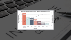
Appropriate Visualizations
Charts can be a powerful tool in your data analytics dashboard—but only if implemented correctly. Poorly chosen charts and other visualizations can actually make your dashboards clunkier and harder to read, with important insights buried in clutter.
To support productive decision-making, dashboards should use the right chart type for the right story. For example:
- Line charts to show trends over time
- Bar charts to make comparisons across categories
- Pie charts to show proportions
Advanced Surgical & Wound Care, for instance, had been relying on time-consuming, manually created spreadsheets. LeapFrogBI built a centralized report repository and surfaced key metrics using charts tailored to user needs. This simplified reporting dramatically reduced time spent in spreadsheets and gave teams more time to focus on revenue-driving activities instead of reporting activity.
Learn more in the case study: Advantage Surgical & Wound Care uses LeapFrogBI to transform manual data labor into data-driven decisions.
User-Centered Design
Executives want a high-level pulse on revenue, growth, and margins. Operational managers usually want more granular views to monitor day-to-day performance. Still, analysts need dynamic filters and customizable dimensions that allow them to drill down into specific trends. One dashboard simply can’t do it all.
Instead, your business needs a portfolio of dashboards, each designed with an end user in mind and tailored to their goals and decision-making cadence.
Take Audibel Hearing Aids, for example. They were using pre-built reports that lacked relevance for day-to-day operations. LeapFrogBI delivered a custom BI solution with KPIs mapped to specific roles and timeframes (daily, weekly, monthly, quarterly, and yearly) so teams can track the metrics that matter to them most, when they matter most.
Learn more in the case study: Audibel has relevant and timely reporting enabled by their 7-year partnership with LeapFrogBI
Customization & Flexibility
Your business is always evolving—and your dashboards need to keep up. Without an adaptive design, static dashboards quickly become obsolete and lose their ability to support decision-making.
Build dashboards with a future focus by designing modular components, setting review cadences, and incorporating feedback loops.
For example, the Ascot Group was unable to trust the data in their reports due to logic gaps, inconsistent definitions, and data anomalies. They struggled with inconsistent reporting and a lack of standardization. LeapFrogBI implemented validation processes, regression testing, and scheduled reviews that gave the Ascot team confidence to trust and act on their reports, knowing data is accurate even as the business evolves.
Learn more in the case study: Ascot uses LeapFrogBI’s expertise to save time and empower users to obtain valuable business insights
5 Different Types of Data Dashboards
ifferent use cases call for different dashboard types. Here’s how to match the right dashboard to your needs:
Dashboard Type | Purpose | Example Use Cases | Example |
Analytical Dashboard | Analyzes historical data to identify trends and patterns | ● Customer churn analysis ● Sales forecasting ● Market attribution | |
Operational Dashboard | Monitor live operations and flag issues in real-time | ● Call center monitoring ● Logistics performance ● IT system uptime | |
Strategic Dashboard | Track long-term goals and company-wide KPIs | ● Executive scorecards ● Financial targets ● Board reporting | |
Data Management Dashboard | Ensure data quality, integrity, and governance are maintained | ● Tracking duplicates ● Missing values ● ETL pipeline health |
How to Build a Data Dashboard
The most important part of building a data dashboard isn’t choosing the right tool—it’s coming up with the right strategy.
The best data analytics dashboards deliver role-specific insights that help teams answer questions, prioritize actions, and make better decisions.
Follow these four steps to build a useful data dashboard:
1. Identify Purpose & Audience
Don’t build dashboards just for the sake of it. Build them to solve real problems in your business.
To start, consider who will use the dashboard—and for what.
For example, will this dashboard primarily be used by executives to support long-term strategy? Is it for sales managers who need to track pipelines and quotas? Or will your finance team lean on the dashboard to monitor spending and budgets?
Pro tip: Avoid trying to build one dashboard for everyone. It’s better to create focused dashboards tailored to specific roles and needs.
2. Select the Right KPIs
Once you know the intended purpose and audience for your dashboard, it’s time to get a little more niche: selecting KPIs.
Good dashboards highlight KPIs that are tied to business outcomes—not just vanity metrics.
For example, if you’re building a dashboard for customer support operations, “average time to resolution” tells a lot more about service efficiency and customer experience than “number of tickets closed.”
Pro tip: Stick to a small, focused set of metrics that tell a clear story and drive action.
3. Choose Your Data Sources
Data dashboards are only as good as the data sources feeding them. And as the saying goes: “Put garbage in, get garbage out.”
To make sure you feed your dashboard with reliable, relevant data sources, take the time to identify where your key metrics live—and remember, this depends on your specific user and goals. For example, if you’re building a dashboard for your marketing team to better track campaign performance, then you may need to connect your dashboard to your CRM, email marketing platforms, and ad platforms.
Pro tip: Use ETL (extract, transform, and load) pipelines to clean and unify data before it makes its way into your dashboards for consistent, accurate reporting.
4. Pick the Right Tool
Choosing the right tool isn’t the first step in building a data dashboard, but it’s still an important one.
There are plenty of options on the market today, such as Power BI, Tableau, Looker, and custom solutions. But don’t let shiny features distract you. After all, tools don’t solve problems; strategy and data do.
At LeapFrogBI, we’re tool-agnostic. We can work with a platform you already use or help you choose one if you’re just getting started. That said, we often recommend Power BI for its flexibility and seamless integration with Microsoft products.
Pro tip: Tool choice matters less than how your data is modeled. Prioritize data prep and structure over bells and whistles.
Common Mistakes to Avoid (Based on Years of Experience)
Even with the best tools and intentions, it’s still easy to build wonky data dashboards, unfortunately.
After working with dozens of companies across industries, we’ve identified the most common mistakes teams make when building dashboards. Here’s what to watch out for:
- Overcomplicating visuals: Too many colors, confusing chart types, or excessive animation can overwhelm users and bury the insights you’re trying to deliver.
- Adding too many KPIs: Including every available metric in your dashboard can water down insights, clutter the layout, and make it harder for users to focus on what matters.
- Forgetting about data governance: Without rules for data consistency and accuracy, your dashboards can end up misleading users and undermine trust in your reporting.
- Building in silos: Dashboards built without cross-team collaboration often miss key business context, forcing users to piece together insights from disconnected sources.
- Creating “set-it-and-forget-it” dashboards: Dashboards should evolve with your business. If you don’t plan for scheduled maintenance, then they’ll fall out of sync with your goals and leave your team working with outdated or irrelevant metrics.
Leave the Heavy Lifting to Us. We’ll Build Your Dashboards
Data dashboards are living, breathing systems that must evolve with your business to reflect changing needs and maintain data integrity.
That’s a full-time job, which is why some companies opt to hire and maintain in-house data teams. But hiring, training, and managing a full-time team is costly, resource-intensive, and time-consuming. By working with a fractional data team, you get expert support without the cost or complexity of an in-house team.
Here’s what you get when you partner with LeapFrogBI to build your dashboards:
Custom Solutions
We don’t believe in off-the-shelf dashboards. Every solution we deliver is custom-built to reflect your workflows, KPIs, and day-to-day operations.
From healthcare and insurance to logistics, manufacturing, and finance, our dashboards are designed to help real-world users solve real-world problems. That means you’ll get a suite of dashboards tailored to the way your teams work, the outcomes you’re working towards, and the decisions you need to make.
Managed Analytics Approach
Many businesses assume they need a full in-house BI team to take advantage of the benefits of data analytics and become truly data-driven. But that’s not the only way.
With LeapFrogBI’s managed analytics approach, you get on-demand access to a dedicated team of data experts who handle everything from data integration and modeling to dashboard optimization—without the cost, responsibilities, or commitments of hiring, training, and managing internal staff.
We’re there when you need us and invisible when you don’t. Our clients rely on us to:
- Set up and maintain reliable data pipelines
- Design flexible, scalable dashboards
- Deliver ongoing improvements based on evolving goals
Highly Regulated Industries are Our Sweet Spot
If you work in healthcare, insurance, financial services, or another highly regulated industry, you face extra challenges when building data dashboards. On top of the typical technical hurdles, you need assurance that your solutions are secure, compliant, and always audit-ready.
That’s exactly what we do.
At LeapFrogBI, we have extensive experience supporting clients in highly regulated environments, such as insurance and healthcare. We know how to design HIPPA-compliant, audit-ready, and governance-driven dashboards that meet strict industry standards.
Bottom line: With us, you don’t have to choose between compliance or user-friendliness. We know how to design for both.
Ready to get started? Get a closer look: Learn more about our Managed Analytics Services and how we help businesses use their data to drive faster, more results-driven decision-making.
Common FAQs
Why Should My Business Use a Data Dashboard?
You can’t make data-driven decisions and become a data-driven business without reliable, consistent access to relevant data—and that can be harder to get than you think. Done right, an expertly designed dashboard makes it possible for your business to get a centralized, real-time view of your most important metrics so you can spot trends, track progress, and use data to make smarter, faster decisions.
What’s the Difference Between a Dashboard and a Report?
Reports are static snapshots that capture a single point in time, while dashboards are live, interactive tools that update in real time.
Reports are typically used for periodic review, like an EOM update about financial performance. Dashboards are live systems you can use on a daily basis to support decision-making across departments.
What KPIs Should I Include in My Dashboard?
You should only include truly useful KPIs in your dashboard, i.e., metrics that are directly tied to business outcomes. For example, if you’re designing a dashboard to help customer support teams, then you should include average time to resolution.
Bottom line: Skip vanity metrics, like number of tickets closed, and focus on KPIs that help your team identify opportunities for improvement.
How Often Should My Data Dashboard Be Updated?
It depends on your use case. For operational dashboards, like call center performance or inventory tracking, data must be updated in real time or near real time. This is key for quick problem-solving and smooth day-to-day operations.
But for strategic dashboards that track long-term goals, like quarterly revenue growth or customer retention trends, you can still get valuable insights with only monthly refreshes.
What matters most is aligning your update cadence with your use case, so your data is always relevant and decision-ready.